Description
Description-Separate-1QControl Introduction
Due to difficulties with using XControls with other classes, libraries, packed-project libraries (PPLs) and the Actor Framework, I created a new framework that gives you many of the benefits of XControls without many of the headaches. I call them QControls. QControls allow easy UI Logic Code reuse, encapsulation and decoupling of the UI Logic away from the Business Logic of the main application and from the UI Skin. Introduction to QControls with tutorials and complete documentation is attached in the PDF. Also in the attached PDF, I explain more about the trade-offs between QControls and XControls. In the toolkit there are examples that are installed into the Example Finder; just search for the keyword "QControls".
You can now download the QControl Toolkit free from the NI Tools Network here.
I would like to hear peoples' feeback and questions here on this discussion. If you like it, please give it a good rating and leave a review on the NI Tools Network page for the toolkit as soon as the feedback page becomes available.
Here are some extra QControls I have created:
AnimationRing QControl
The AnimationRing QControl is based on a picture ring control. The elements in the picture ring represent frames of the animation. The frame rate is settable via property node. The animation only occurs when the ring is visible. Setting the ring control to not visible effectively pauses the animation.
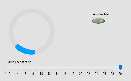
This is a screenshot of the example VI showing one of the ring controls. Any ring control can be swapped out and used.
Calendar QControl
Here is another QControl that I had programmed earlier as an XControl. I decided I wanted to try reprogramming it as a QControl. I call it the Calendar QControl. The Calendar QControl is a cluster with multiple controls inside of it. The Calendar Facade Control should be used on the Front Panel of the VI that uses this QControl. The references of the elements of the cluster are handled by editing the Load Reference Method. The Event Handler Method uses the references to control all of the behavior. When in use in the main application, the Calendar: Value Change Event (on all elements of the cluster) will fire whenever the date has changed. See the Test Calendar.vi that is part of the class for an example.
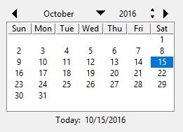
All of the colors, the first day of the week, and the visibility of the Horizontal Lines, Vertical Lines, Today Button, and Month-Year Selectors are changable through Properties (using property nodes on the QControl Class wire).
OrderSelection QControl
Here is another QControl I created to try to answer a question in the discussion board. You can access the original question here.
The requirement the OP of the question needed was a control that could help his application's user order a list of items. This is quoted from his post:
"I need a simple way for my users to be able to select and order a number of items... I would prefer to provide a larger iconic representation of the items and present them horizontally, since they will ultimately represent column headers in a data file. Drag and drop would of course be needed." from @auspex
So I decided to attempt a control like he described using the QControl Toolkit. Here is a view of what the OrderSelection QControl looks like but it is customizable. It is based on a picture control. The item image is a PNG in the facade folder in the QControl Class. You can change it if you want a different look (either name the new PNG the same or edit the code in the initialize control method that reads in the PNG). All of the programming for the item sizing is based around the size of the item PNG and the size of the picture control.

Use the "Test OrderSelection.vi" as an example of how to use it. Using it is as easy as setting the 1D array of Items in a property, getting the value change event on the picture control, and then reading the 1D array of Items back out.
Description-Separate-2


