- Subscribe to RSS Feed
- Mark Topic as New
- Mark Topic as Read
- Float this Topic for Current User
- Bookmark
- Subscribe
- Mute
- Printer Friendly Page
One UI Window or several?
05-05-2015 04:46 AM
- Mark as New
- Bookmark
- Subscribe
- Mute
- Subscribe to RSS Feed
- Permalink
- Report to a Moderator
My application requires that as well as the main data display, there be a displayed history of commands sent as well as a displayed history of application status. My question is whether all this information should be in one UI window or break it up into several, e.g., main UI, command window, status window. My main UI as it stands, has two sub-panels, one for the command history and one for the mission information. The status window is separate as in the screenshot.
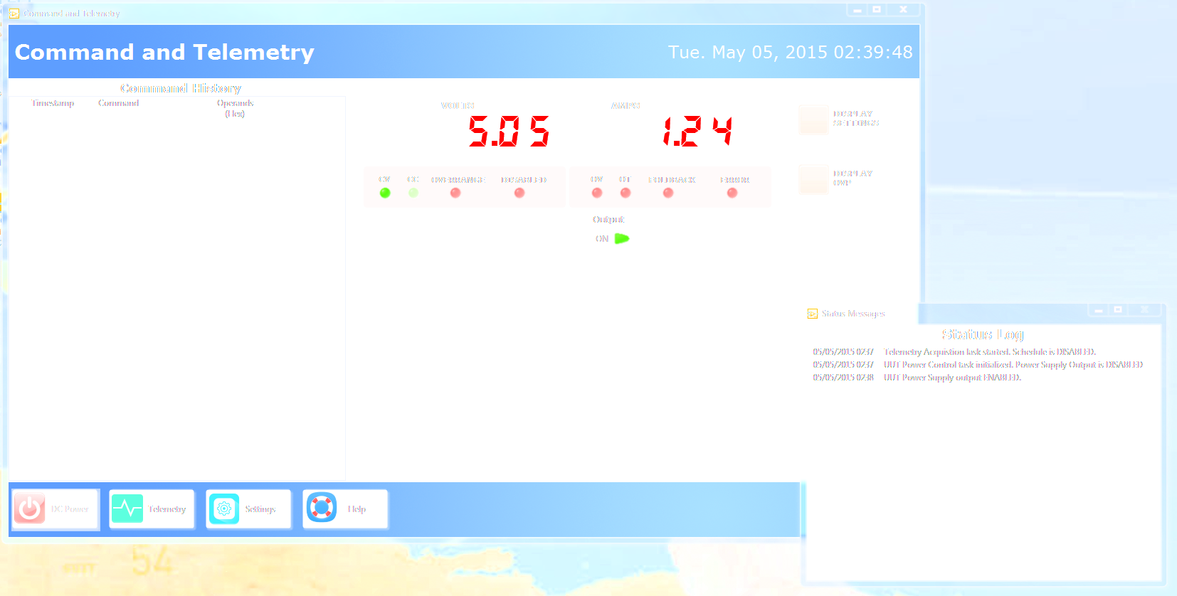
Would it be better to shorten the current command history sub-panel and fit another sub-panel for the status or make the command history a separate window which then gives more real-estate in the main UI for the data display?
05-05-2015 05:05 AM
- Mark as New
- Bookmark
- Subscribe
- Mute
- Subscribe to RSS Feed
- Permalink
- Report to a Moderator
Do both histories need to always be visible?
I have a few suggestions:
1. Have a subpanel that can view command history or status history
2. Have a sliding subpanel so that user can slide the histories out of the screen (like in Simon's win 8 UI demo), giving the main UI full real-estate
3. Put both histories in separate windows, and have a button/menu/etc. In main UI to open them if user closes them. it should still log to these VIs, they just won't be visible.
4. Fit in another subpanel for the status as you suggested.
If I were pressed for time, I would choose 1. If not, I would choose 2. However, the decision ultimately rests with your user - what do they want? Are they using the histories all the time or only sometimes? If they always want to see it, it would be more convenient to have them all in the main window. If it's used sporadically, the other options would be better.
― Terry Pratchett
05-05-2015 12:43 PM
- Mark as New
- Bookmark
- Subscribe
- Mute
- Subscribe to RSS Feed
- Permalink
- Report to a Moderator
Thanks for the reply. This is a ported application (to AF) with a face lift. The command window was part of the main UI and there was no status window. The status window is being added as the users wanted a little more information on the app itself. I'll weigh these options and see what will fit their needs the best.
05-05-2015 04:27 PM
- Mark as New
- Bookmark
- Subscribe
- Mute
- Subscribe to RSS Feed
- Permalink
- Report to a Moderator
I coded up a sliding tab control using the "Move.vi" I found on the forum and that works....however, the space left is not used by the main pane because of a splitter. Splitter Position seems to be a unique property since it only has one value, eg., versus a cluster of "Top/Left" like any other control so "Move.vi" won't work with splitters. I'll make a version that does. If all I do is move the splitter, the tab control will be hidden behind the main pane when it expands and then shown again when the splitter moves back. Good enough.
05-06-2015 12:51 AM
- Mark as New
- Bookmark
- Subscribe
- Mute
- Subscribe to RSS Feed
- Permalink
- Report to a Moderator
Sure, moving the splitter works, I did something similar with splitters and subpanels in another project, where I moved graphs off-screen. Didn't think about that one in this case for some reason... Even simpler 
Good luck!
Danielle
― Terry Pratchett
05-12-2015 10:08 AM
- Mark as New
- Bookmark
- Subscribe
- Mute
- Subscribe to RSS Feed
- Permalink
- Report to a Moderator
Can I make a suggestion regarding suggestion number two by Danielle - DON'T DO IT!!!!!  Having taken a couple of the interesting things that Simon has done and ported them to different bench tops, these little tricks are hideous to make your own. If you are going to go through the pain of configuring sliding windows for different applications (which, btw, I have found my users despise), I discovered that this is (currently) not what LV is particularly good at. Stick with tabs, splitters, subpanels and popups. Stay away from these pretty little UI tricks - they are real time wasters. And in LV, the result is always less than satisfying...
Matt
05-12-2015 12:57 PM
- Mark as New
- Bookmark
- Subscribe
- Mute
- Subscribe to RSS Feed
- Permalink
- Report to a Moderator
The short answer is what I think everyone agrees on: a history like that is something the user will only want to occasionally see. Which means it should be "hidden" in a tab or other not-always-visible way.
I have to agree that a fancy sliding-panel trick might be more trouble then it's worth, and it violates one of the general design priniciples - Keep It Simple!
If you can find a more "windows-standard" way of doing it, you're better off. Users seem to like tabs.
Prototype it and show your customer. Customers generally like "Here's what I'm thinking, design-wise" discussions as it makes them feel involved and in control.
-Jason
05-12-2015 03:19 PM
- Mark as New
- Bookmark
- Subscribe
- Mute
- Subscribe to RSS Feed
- Permalink
- Report to a Moderator
I can understand your concerns about overdoing it, however, in my case, I used a simple "panel management" class I found in another demo and tailored it for my use. And it works well. I didn't go overboard or try anything as complicated as the Win8 demo. The users want to see more than one piece of information at once, so a quick button tap to see status and command histories next to the main data pane or a quick tap to hide them was preferable to my users over, for example, separate windows for the loggers (which actually would have been easier than dealing with sub-panels).
05-13-2015 05:09 AM
- Mark as New
- Bookmark
- Subscribe
- Mute
- Subscribe to RSS Feed
- Permalink
- Report to a Moderator
BillMe, that's similar to what I did in the Graph UI I mentioned - the user wanted to see 1-4 graphs, at the press of a button I moved splitters to move the other graphs in or out of the window.
I'm glad it worked out for you
Danielle
― Terry Pratchett
