Turn on suggestions
Auto-suggest helps you quickly narrow down your search results by suggesting possible matches as you type.
Showing results for
Histogram Generator
by:
jkurtw
10-24-2011
02:25 PM
Last Edited by:
jkurtw
01-30-2017
08:58 AM
Document options
- Subscribe to RSS Feed
- Mark as New
- Mark as Read
- Bookmark
- Subscribe
- Printer Friendly Page
- Report to a Moderator
Code and Documents
Attachment
Download All
Virus scan in progress. Please wait to download attachments.
I recently had to crank through a lot of data and generate reports on it - specifically histograms. The attached code generates PNG files of all the data you throw at it. You can then use these PDFs in reports or throw them into a PDF. I will also attach my Apple Automator script that will take all the PNGs and put them in a PDF file.
All this code was developed specific to my use case, but feel free to tweak it as needed.
Here are some notes that might help you:
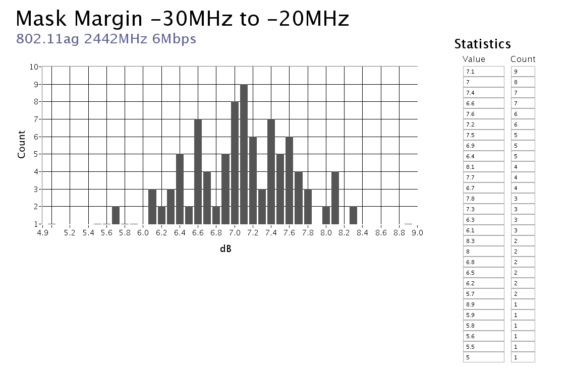
- Required format for input data is a tab delimited file with a unique histogram in each column (the column header will be put in the histogram as the title)
- See example file attached 802.11ag 2442MHz 6Mbps.txt
- Data files should have the desired precision already set (if you want 1 decimal place, don't put more in your data set. The Histogrammer will match the bins to the number of decimals you have - it is a frequency chart really not a histogram. You can easily change this in the code if you want)
- Column headers marked with '*' (asterisk) in their title will be skipped
- Column headers can also contain the X-axis label, separated from the title with a comma. For example "My Data Set, dB" in the tab delimited file would generate a histogram with the title "My Data Set" and "dB" on the X axis.
- Code is currently set to pull in 100 rows
- Create histogram.vi inside the code has the number of rows hardcoded to 100 - change it if you have a larger data set
- The VI can be pointed at a single data file or a top level folder containing more folders with data files... like this
- My Data Set (folder)
- Channel A (folder)
- Test 1.txt (tab delimited data file)
- Test 2.txt
- Channel B (folder)
- Test 1.txt
- Test 2.txt
- Channel C (folder)
- Test 1.txt
- Test 2.txt
- Channel A (folder)
- My Data Set (folder)
- The data files name ("Test 1" from above) will be used as a subtitle on the histogram
Example code from the Example Code Exchange in the NI Community is licensed with the MIT license.
Comments
Options
- Mark as Read
- Mark as New
- Bookmark
- Permalink
- Report to a Moderator
07-08-2018
04:30 AM
