LabVIEW Idea Exchange

cancel
Showing results for 
Search instead for 
Did you mean: 
JackDunaway

Smaller Event Ref Constants

Status: New

Re-opening because LabVIEW NXG has been discontinued.

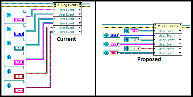
The smaller footprint of the Local Variables in 2010 has increased usability of the IDE and readability of the LabVIEW language. Another node that could benefit from a smaller footprint is the User Event Ref Constant.


Below is some conceptual artwork on what a smaller footprint might look like. Feel free to post more concepts!


21658iE20B431D386A4E45

29 Comments
AristosQueue (NI)
NI Employee (retired)

> "NI should not allow as much configuration for impotent features

> that only increase confusion for users and maintenance for R&D"


Here you and I agree, but I come down on the side of eliminating the "ambiguous but smaller" version. I'm a fan of the large FPTerminals and use them on all my VIs. Same applies here. It would be nice if the display was small, but showing the complete type is -- to me -- far more important. I'd kudos an idea to change the draw style to something smaller if that smaller view conveyed additional information. Otherwise, you're just exchanging one view that I don't use for another view that I don't use. [For people who don't know me who are reading this, I generally comment as an R&D developer, where I may encourage an idea that I myself won't actually use, but I give kudos as a LV user, so that's reserved only for ideas I think would actually make LV better for me.] Thus I'm wondering if there is some way to pack the additional information into the smaller space.


Looking at the various redesigns that have been proposed or achieved in LV 2010, it seems that most users are more open to things growing horizontally than growing vertically (the one spaces stuff out, which is undesirable, but the other makes bendy wires, which is anathema). The typical banner icon of a class (just the banner, as defined in the .lvclass file) is 32 pixels wide and 12 pixels tall. That barely fits in your current model. If you make the redesign 2 pixels wider, we have enough space to give a good margin on both edges.

23432i6571A02E4F2258CC


For typedefs, we could clip the user's icon to show the bottom 12 pixels (because the top 12 pixels will be the banner for the library that owns that typedef). Perhaps not terribly useful for existing typedefs, but possibly useful going forward once people begin designing for that use case.


Thoughts?


> As for classes, the wire appearance coming from the Constant should be enough of a visual cue to identify the class.


That's not an approach that can generally work. First, there's a practical problem: there aren't enough patterns to give every class a unique one, and differentiating by color alone is generally a bad idea unless those colors differ substantially in both hue and saturation. That makes a pretty narrow range of usable wire appearances. Second, the memory load is fairly high for what wire pattern represents what type. An icon carries substantially more visual cues about what it means than a wire pattern/color does. It is for this reason that the LV style guide strongly encourages creating unique wire appearances only for LVClasses that are a substantial part of your overall application, leaving most classes as the default appearance (or inheriting from their ancestor).


JackDunaway
Trusted Enthusiast

>> I'm wondering if there is some way to pack the additional information into the smaller space.


Increase information density! Here we agree again!


>> it seems that most users are more open to things growing horizontally than growing vertically (the one spaces stuff out, which is undesirable, but the other makes bendy wires, which is anathema)


 As you point out, horizontal boundaries are negotiable, while vertical boundaries are constrained to external reference dimensions (expandable nodes such as property nodes).


>>  If you make the redesign 2 pixels wider...


... I would go even further than 2px in order to spread things out so it doesn't look as cluttered - I'm fine with 4 or 6 or more additional pixels. Having the class banners instead of the "object" cube is a great idea.


>> First, there's a practical problem: there aren't enough patterns... Second, the memory load is fairly high... An icon carries substantially more visual cues


I agree with your diagnosis. And I agree the wire, or the terminal, or the constant, or fill-in-the-BD-node should contain visual clues identifying datatype - the question is, how much information is really necessary? I contend Context Help should be the exhaustive reference for datatype, while the block diagram would foster a more productive workflow by abstracting info that's not always relevant. Case in point: one of the most popular ideas of all time - a "reeally good" idea [41:22], so good it got implemented in 2010 - is nothing but a simple way to abstract datatype information that does not always need to be visible. I guess my point is this: you're right, that you can't mentally juggle all your datatypes, but you can get pretty close based on visual clues that don't take up too much BD real-estate, and CH can fill in the gaps in your memory.

AristosQueue (NI)
NI Employee (retired)

It's a balance. That's what these forums are... pushing back and forth until we find the sweet spot that works for most people. 🙂

CM411
Member

Very good idea, that would be a great help at the BD

Darren
Proven Zealot
Status changed to: In Development
 
Darren
Proven Zealot
Status changed to: Completed

Available in LabVIEW NXG 1.0. The size of user event refnum constants is the same as other constants, and aligns with the terminal height of the Register For Events node.

Christina_R
Active Participant
Status changed to: New

Re-opening because LabVIEW NXG has been discontinued.


Christina Rogers
Principal Product Owner, LabVIEW R&D
LoisLbs
Member

Same problem with controls references ! 

For example, I used to bundle all my UI controls references in cluster to have access of them anywhere.

When I have a lot of connections to make, it is really annoying to handle not straight wires and not see each control in front of its "bundled" name ...

LoisLbs_0-1674114598601.png


Darren
Proven Zealot

I overlap my control references by a few pixels each so that the terminals do line up.

refs.png