- Subscribe to RSS Feed
- Mark Topic as New
- Mark Topic as Read
- Float this Topic for Current User
- Bookmark
- Subscribe
- Mute
- Printer Friendly Page
functionality on the graph
04-26-2024 07:32 AM
- Mark as New
- Bookmark
- Subscribe
- Mute
- Subscribe to RSS Feed
- Permalink
- Report to a Moderator
Hi, Hello, I am developing data acquisition code on labview and I would like to add functionality, I display my data (2 parameters) on a single graph; I want to display the min, max and average of each parameter, I tried with propery node but it only displays the max and min of one of the data (the most important)? how can I fix this
and the second question, could I use code to change the scale of my graph so that, if necessary, I could have more detail on the graph?
thanks in advance
04-26-2024 07:42 AM
- Mark as New
- Bookmark
- Subscribe
- Mute
- Subscribe to RSS Feed
- Permalink
- Report to a Moderator
Hi amel,
@ameletudiante99 wrote:
I would like to add functionality, I display my data (2 parameters) on a single graph; I want to display the min, max and average of each parameter, I tried with propery node but it only displays the max and min of one of the data (the most important)? how can I fix this
By writing "working code according to the requirements".
@ameletudiante99 wrote:
could I use code to change the scale of my graph so that, if necessary, I could have more detail on the graph?
Yes.
General suggestion: when we should discuss problems in your code then you should attach this code…
04-26-2024 08:19 AM
- Mark as New
- Bookmark
- Subscribe
- Mute
- Subscribe to RSS Feed
- Permalink
- Report to a Moderator
hi
Here is my code,
I don't understand what you mean by By writing "working code according to the requirements".
can you please point me in the right direction, I have no idea how to do this?this?
04-26-2024 09:23 AM
- Mark as New
- Bookmark
- Subscribe
- Mute
- Subscribe to RSS Feed
- Permalink
- Report to a Moderator
04-26-2024 05:22 PM
- Mark as New
- Bookmark
- Subscribe
- Mute
- Subscribe to RSS Feed
- Permalink
- Report to a Moderator
You can have a routine to find the max, min and average of the data, then plot them together. but depends how your are ploting them, You can plot htem as waveform and as a chart .
Please save your code for labview 2020.
04-27-2024 09:58 AM
- Mark as New
- Bookmark
- Subscribe
- Mute
- Subscribe to RSS Feed
- Permalink
- Report to a Moderator
You have two main choices:
- Create additional waveforms with constant values and display them as additional plots
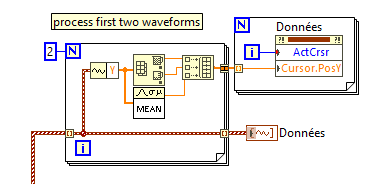
- Create horizontal cursors and place them at the min/max/mean, etc. for each plot.
Here's a subVI that would process one waveform to create the others for max,min,mean (case 1), call it for each.:
And here's how you could set the cursors (make sure you define 6 cursors first)
04-27-2024 12:56 PM
- Mark as New
- Bookmark
- Subscribe
- Mute
- Subscribe to RSS Feed
- Permalink
- Report to a Moderator
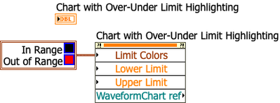
Many years ago I made an XControl that has over/under limit highlighting (it's one of my early XControls, so it's not so polished). Maybe you can use that as a guide to build something.
04-27-2024 01:43 PM - edited 04-27-2024 01:44 PM
- Mark as New
- Bookmark
- Subscribe
- Mute
- Subscribe to RSS Feed
- Permalink
- Report to a Moderator
@ameletudiante99 wrote:and the second question, could I use code to change the scale of my graph so that, if necessary, I could have more detail on the graph?
thanks in advance
There are properties for auto-scale, min and max of the x and y axis and they can be modified via the relevant property nodes. Of course you should turn off autoscaling when setting defined min and max, else it is futile.
04-29-2024 01:28 AM
- Mark as New
- Bookmark
- Subscribe
- Mute
- Subscribe to RSS Feed
- Permalink
- Report to a Moderator
Hi ;
hi, here is the code in the photo, I will no longer have access to my labview software until next week
Thanks a lot
04-29-2024 01:35 AM
- Mark as New
- Bookmark
- Subscribe
- Mute
- Subscribe to RSS Feed
- Permalink
- Report to a Moderator
Hi;
thanks I will try


