- Subscribe to RSS Feed
- Mark Topic as New
- Mark Topic as Read
- Float this Topic for Current User
- Bookmark
- Subscribe
- Mute
- Printer Friendly Page
Adding an XY graph element only while a specific state is running in a state machine.
01-03-2023 10:50 AM - edited 01-03-2023 11:01 AM
- Mark as New
- Bookmark
- Subscribe
- Mute
- Subscribe to RSS Feed
- Permalink
- Report to a Moderator
Hello,
I'm working on a state machine that actively plots multiple data points during a test. If certain criteria are met, the state machine enters a state that would add an element to the front panel XY graph. My question is, what would be the easiest way to add that occasionally needed data from the state machine to the front panel XY graph?
More details on my test: I'm plotting THD (total harmonic distortion) versus frequency. The test will typically reach a point where THD has reached a predetermined point that is considered failing. At that point, I want to drop the signal level by -3dB and continue tracking THD with the reduced signal. When this happens, I want to track this on the front panel chart with a unique element that signifies that it's plotting the -3dB level. But this element only comes into play if the user checks 'yes' on a boolean input to perform this.
To this point, I haven't found an easy way to add an element to an XY chart during the test. Let me know if my actual code is needed. I felt like this could be a pretty generic situation that could be solved without requiring my code.
Disclaimer: I'm not an experienced LabVIEW coder and I'm learning as I go. If my code is inefficient, (which in some cases it probably is) please go easy on me.😁
Thanks!
01-03-2023 11:00 AM
- Mark as New
- Bookmark
- Subscribe
- Mute
- Subscribe to RSS Feed
- Permalink
- Report to a Moderator
@JayWW wrote:
To this point, I haven't found an easy way to add an element to an XY chart during the test. Let me know if my actual code is needed. I felt like this could be a pretty generic situation that could be solved without requiring my code.
Your code would still give us a good baseline. For example if you are using the build xy graph express VI, don't. 😄
Easiest would be to keep the xy data in a complex 1D array (XY graphs will accept that and graph IM vs RE). You would just append one point at a time as needed. Make sure to use a plot style that use points. if you only use lines, the first point will not show.
01-03-2023 11:07 AM
- Mark as New
- Bookmark
- Subscribe
- Mute
- Subscribe to RSS Feed
- Permalink
- Report to a Moderator
@altenbach wrote:
@JayWW wrote:
To this point, I haven't found an easy way to add an element to an XY chart during the test. Let me know if my actual code is needed. I felt like this could be a pretty generic situation that could be solved without requiring my code.
Your code would still give us a good baseline. For example if you are using the build xy graph express VI, don't. 😄
Easiest would be to keep the xy data in a complex 1D array (XY graphs will accept that and graph IM vs RE). You would just append one point at a time as needed. Make sure to use a plot style that use points. if you only use lines, the first point will not show.
Hi Altenbach,
Will an XY Graph accept multiple complex 1D arrays? If data is not actively being harvested from a graph element, will something still be plotted from the inactive element? Would non-complex data behave the same in the graph?
Thanks!
01-03-2023 11:13 AM
- Mark as New
- Bookmark
- Subscribe
- Mute
- Subscribe to RSS Feed
- Permalink
- Report to a Moderator
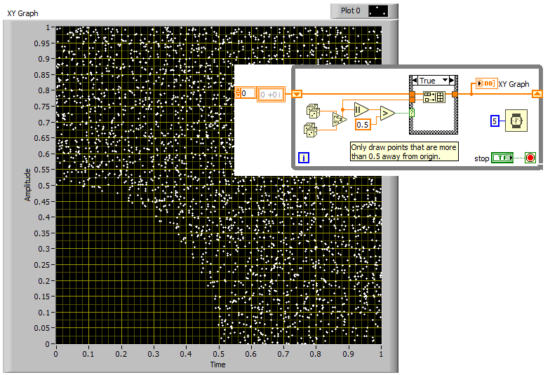
Here's a quick example for suggestion mentioned earlier:
Yes, you can have as many plots as you want. Just create an array of clusters where each cluster contains a 1D complex array.
01-03-2023 11:28 AM
- Mark as New
- Bookmark
- Subscribe
- Mute
- Subscribe to RSS Feed
- Permalink
- Report to a Moderator
01-03-2023 01:48 PM
- Mark as New
- Bookmark
- Subscribe
- Mute
- Subscribe to RSS Feed
- Permalink
- Report to a Moderator
@altenbach wrote:
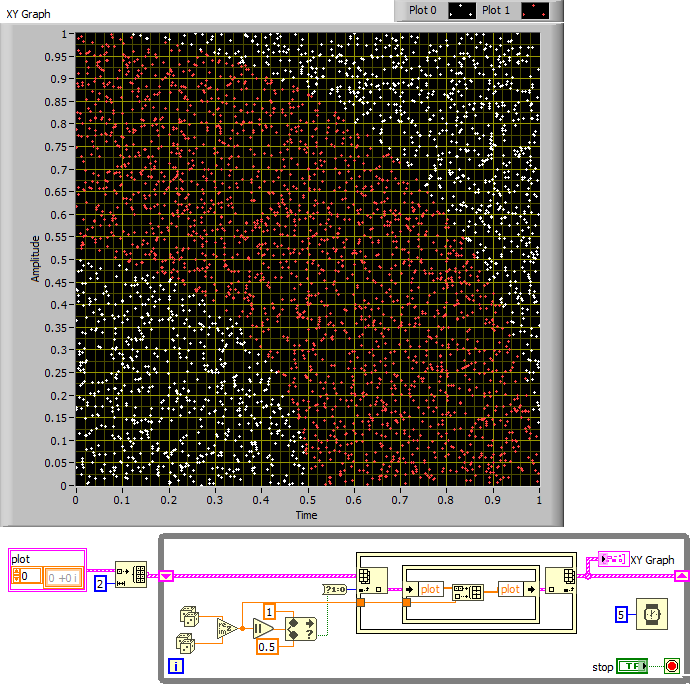
Here's with two plots. Points get conditionally added to one of the two.
Thanks for sharing these examples. I'm hoping you can share more information on how the two-plot version works. There are several things in there that I haven't explored yet. Thanks again!
01-03-2023 03:12 PM
- Mark as New
- Bookmark
- Subscribe
- Mute
- Subscribe to RSS Feed
- Permalink
- Report to a Moderator
@JayWW wrote:
Thanks for sharing these examples. I'm hoping you can share more information on how the two-plot version works. There are several things in there that I haven't explored yet. Thanks again!
Sorry, I am currently not near the computer where I wrote that code earlier.
- We have an array with two elements, one for each plot, each initially containing an empty complex array.
- We generate a pair of random numbers to form a complex number. The magnitude of a complex value is the same as the absolute value and we decide if r is inside or outside the range 0.5..1.
- The boolean for "in range" can be either true or false, and converted to 0,1 can be either 0 or 1, which we use to pick either plot 0 or plot 1 on the outer IPE. The inner IPE gets the current complex array for that plot and appends the new value.
- You can easily add values based on other criteria, of course. The sky is the limit!
- If you generate a huge number of points, it would be easier to map them into a 2D array displayed in an intensity graph for full in-placeness and up to 256 colors pickable for each point. (not shown)
See how far you get... 😄
01-05-2023 10:22 AM - edited 01-05-2023 10:28 AM
- Mark as New
- Bookmark
- Subscribe
- Mute
- Subscribe to RSS Feed
- Permalink
- Report to a Moderator
01-05-2023 10:38 AM
- Mark as New
- Bookmark
- Subscribe
- Mute
- Subscribe to RSS Feed
- Permalink
- Report to a Moderator
Altenbach is storing all the state in a shift register, which is the cleanest way to handle these sorts of things, but depending on your architecture, you could opt for the (much slower) Value property node of your XY graph indicator.
Additionally, he's using an inplace element structure with the Index/Replace node (that's the tan box with thin border and the index array built into it). This just prevents the program from making unnecessary copies of the XY graph state, but is also quite expressive for operating on clusters and arrays of all kinds.
The in-range stuff is mostly a clever way of implementing a polar plot on complex numbers, using random numbers in a sort of Monte Carlo method.
Hope that clears up any other questions you had!
01-05-2023 11:00 AM
- Mark as New
- Bookmark
- Subscribe
- Mute
- Subscribe to RSS Feed
- Permalink
- Report to a Moderator
@altenbach wrote:
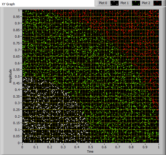
Here's the second VI and also one with three colors.
What would be the easiest way to get it to look like the image I attached? The blue would be the input signal level at full power. The purple would be input signal at -3dB. The red is the output signal THD value and yellow would be THD at -3dB. Thanks!


