- Subscribe to RSS Feed
- Mark Topic as New
- Mark Topic as Read
- Float this Topic for Current User
- Bookmark
- Subscribe
- Mute
- Printer Friendly Page
Time of Maximum Chart
Solved!07-08-2011 10:50 AM
- Mark as New
- Bookmark
- Subscribe
- Mute
- Subscribe to RSS Feed
- Permalink
- Report to a Moderator
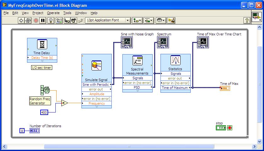
I need to draw a chart that shows the behavior of the frequency of the spectral peak of the signal over time. I thought this VI would work fine:
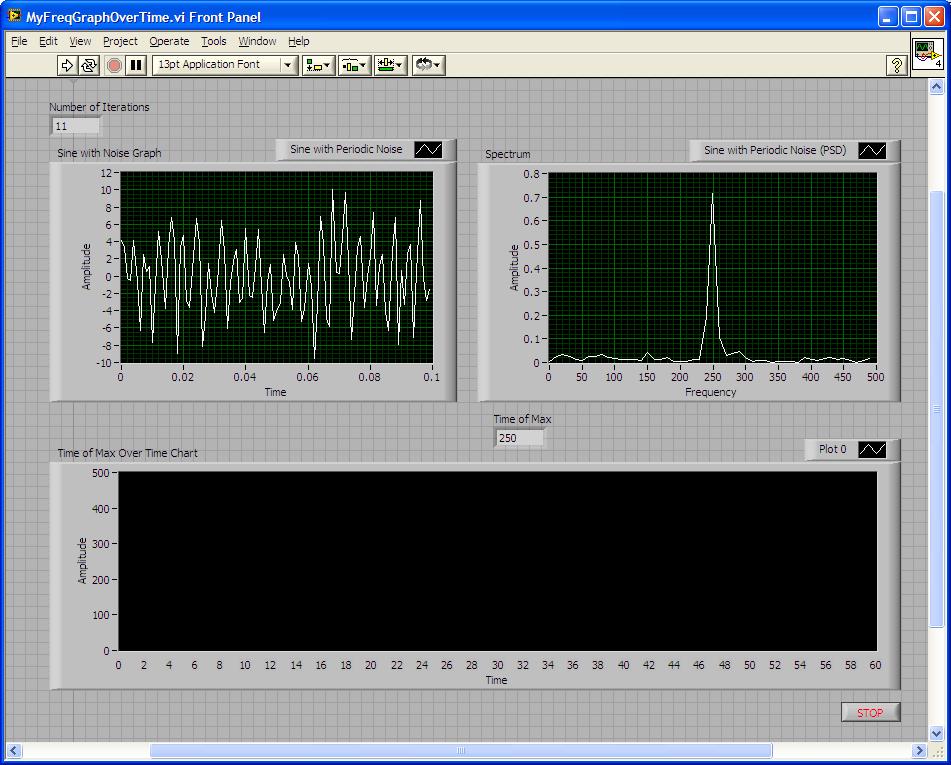
The interesting thing is that before connecting the Time of Maximum output of the Statistics block to the Time of Max Over Time Chart, the chart shows the settings properly:
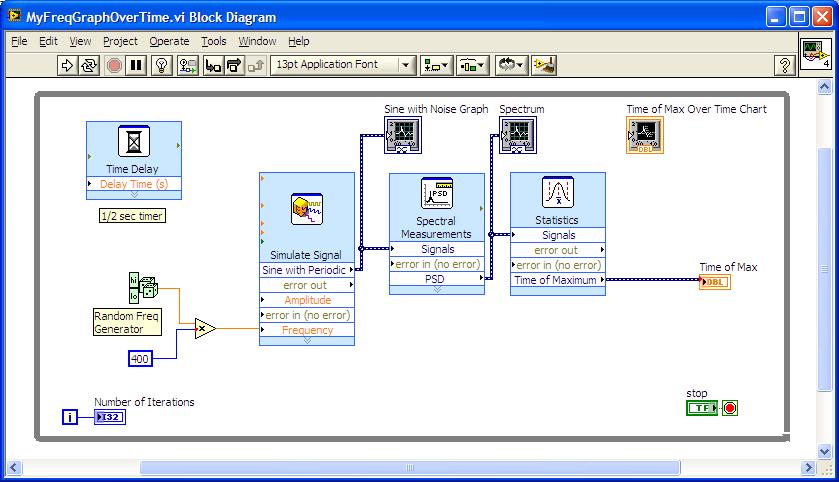
Here is the corresponding Block Diagram for the Front Panel above:
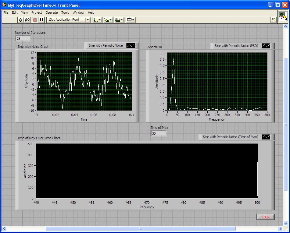
But once I connect the Timeof Max Over Time Chart to the Time of Maximum output of the Statistics Block and run the VI, the Time (X-Axis) of the chart changes to Frequency X-Axis:
Again, I want the chart to display the changes of peak frequency value over time. Any suggestions? I attached the VI below. Thanks!!
Solved! Go to Solution.
- Tags:
- statistics
07-11-2011 11:31 AM
- Mark as New
- Bookmark
- Subscribe
- Mute
- Subscribe to RSS Feed
- Permalink
- Report to a Moderator
Hello wprice
Are you able to post your VI? I think I'd like to do some experimentation. I would like to actually see what data is coming out of the "Time of Maximum" output. It should just be a double as per the indicator but the fact that it's displaying as a frequency function in a chart makes me feel otherwise. Are you able to adjust any of the graph properties? I would want to break apart the output and take a look at the data unless of course it really is just a double value.
Please let me know as I am committed to seeing this issue resolved. All the best!
Greg S.
07-11-2011 12:57 PM
- Mark as New
- Bookmark
- Subscribe
- Mute
- Subscribe to RSS Feed
- Permalink
- Report to a Moderator
Hi Greg,
I thought I attached it, but here it is again. Yes, the graphs properties are adjustable - no problems there.
Thanks!
Walter
07-11-2011 02:01 PM
- Mark as New
- Bookmark
- Subscribe
- Mute
- Subscribe to RSS Feed
- Permalink
- Report to a Moderator
Hello wprice
I converted the dynamic data to a double and was able to see the values display with respect to time. Can you let me know if this is the right direction in which you wish to proceed?
Thank you very much!
Greg S.
07-11-2011 03:16 PM - edited 07-11-2011 03:21 PM
- Mark as New
- Bookmark
- Subscribe
- Mute
- Subscribe to RSS Feed
- Permalink
- Report to a Moderator
Greg,
I was not able to open the VI - my LabVIEW version is 9.0.1 only. but I tried to convert dynamic data to a double and it worked!
Thanks so much! Another question that I have is - is there a way to add a line that would work as a threshold to the waveform chart? The the threshould should be visible at all times.
Thanks,
Walter
07-11-2011 03:51 PM
- Mark as New
- Bookmark
- Subscribe
- Mute
- Subscribe to RSS Feed
- Permalink
- Report to a Moderator
Never mind - I got it - thanks!
07-11-2011 04:03 PM
- Mark as New
- Bookmark
- Subscribe
- Mute
- Subscribe to RSS Feed
- Permalink
- Report to a Moderator
Hello wprice
You can absolutely add a threshold into your code. What are you looking at bouding? It may be as simple as a case structure or some mathematics. Please let me know, I believe you can get your issue resolved easily.
All the best!
Greg S.
07-12-2011 08:59 AM
- Mark as New
- Bookmark
- Subscribe
- Mute
- Subscribe to RSS Feed
- Permalink
- Report to a Moderator
Greg,
One more question. Is there a nice way of adding markers to the waveform chart? Ideally that would be a vertical line with a text following the marker that can be inserted to the chart by pressing a keyboard key, say 0-9 numeric keys.
Any suggestions?
07-13-2011 11:45 AM - edited 07-13-2011 11:48 AM
- Mark as New
- Bookmark
- Subscribe
- Mute
- Subscribe to RSS Feed
- Permalink
- Report to a Moderator
Hello wprice
I highly recommend creating a new forum post for this issue as it is different from the original issue. This will not only ensure that it gets the proper attention from the community but it will speed resolution and allow users to more easily search for a similar solution should they have a similar issue. Rest assured that this will be assigned to one of our engineers so this is guaranteed to get resolved!
As a starting point, please consider the portion of this document titled
Customizing Graph and Chart Appearance from the Customizing Graphs and Charts Help document
http://zone.ni.com/reference/en-XX/help/371361G-01/lvconcepts/customizing_graphs_and_charts/
All the best!
Greg S.


