- Subscribe to RSS Feed
- Mark Topic as New
- Mark Topic as Read
- Float this Topic for Current User
- Bookmark
- Subscribe
- Mute
- Printer Friendly Page
- « Previous
-
- 1
- 2
- Next »
What makes a good UI? Crazy UI examples?
10-04-2015 09:52 PM
- Mark as New
- Bookmark
- Subscribe
- Mute
- Subscribe to RSS Feed
- Permalink
- Report to a Moderator
I honestly don't think it's a good UI. It's just something I came up with. The UI is designed for a university professor who will use a touchscreen to operate the chamber. The colors imo sticks out better when using deep grey backgrounds. Most people in the industry follow white backgrounds and I just feel it's way to common. The idea is to give the customer something different for a change.
So far, customers have had no compaints.
However, my boss tells me it doesn't look lively. He wants stuff like motors and blower images with animations...as in stuff you find on HMI packages like factorytalk (Rockwell) or vijeo designer (Schneider). Problem with labview is, DCS module is too darned expensive.
Just thought i'd share my UI. I just don't come across too many dark looking labview UIs and I am looking for ideas and thoughts.
10-07-2015 08:01 AM
- Mark as New
- Bookmark
- Subscribe
- Mute
- Subscribe to RSS Feed
- Permalink
- Report to a Moderator
Hi Joey,
I think a good UI presents information and/or offers control to the user in an intuitive and visually pleasing way. Some aspects of these principles:
-Controls and indicators should be logically grouped
-Controls and indicators should match in size, style, and relative orientation
-Labels should be clear and concise
-Operator should be able to get a quick status summary at a glance: pass/fail LEDs, progress bar, status updates, etc
Hyperbaric has demonstrated many of these concepts in their UI. The original post shows how NOT to follow these principles.
Hyperbaric, I'll also point out that our eyes are better at reading light text on dark backgrounds (like you've shown) than dark text on light backgrounds (like a Word document), and dark displays use less energy, so you can let your boss know you're looking out for the customer's health and budget ![]()
I'd love to see NI offer complex UI templates, with pull out menus, panes, tabs, or other mechanisms to hide unnecessary diagnostic information or advanced features to create a simple user experience for our customers. The project templates have really helped me deliver high-quality code on the block diagram side, I think the Front Panel version could be equally helpful.
Thanks,
Alexandra
10-07-2015 08:13 AM
- Mark as New
- Bookmark
- Subscribe
- Mute
- Subscribe to RSS Feed
- Permalink
- Report to a Moderator
I agree.
One good way to check you GUI design for logical grouping and easy overview is to take a screen shot, open it in a photo editing program like Photo Shop and apply 40% Gaussian Blur. If you can still see logical grouping of GUI items and feel that you can maintain the overall overview, you are in the right track.
![]()
Jens Christian Andersen.
CLA, CTA, CPI
10-07-2015 10:55 AM
- Mark as New
- Bookmark
- Subscribe
- Mute
- Subscribe to RSS Feed
- Permalink
- Report to a Moderator
J.C._Andersen wrote:I agree.
One good way to check you GUI design for logical grouping and easy overview is to take a screen shot, open it in a photo editing program like Photo Shop and apply 40% Gaussian Blur. If you can still see logical grouping of GUI items and feel that you can maintain the overall overview, you are in the right track.
I'm going to try that. Thanks for the tip!
10-07-2015 11:44 AM
- Mark as New
- Bookmark
- Subscribe
- Mute
- Subscribe to RSS Feed
- Permalink
- Report to a Moderator
There are lots of LabVIEW users who are not actually a programmer (like me). As a mechanical engineer, who designs the daq, process and UI algorithms all by myself, I think the UI should do the job in the first place. Then the 'smart design' follows. One can easily spend months to impelement a design pattern like queued producer-consumer loops and get nothing in the end. This kind of struggling makes my-kind-of-programmers to look for the 'safe' solution and that makes UI interfaces messy most of the time...but you have a working stuff in the end.
Regarding all of the experiences I had, I would say a good UI:
- Should have a conceptual design before programming, both algorithmically and visually
- Should get the job done properly without missing slightest detail.
- Should definetely not be designed by using standard LV front panel objects ![]()
- Should have really simple-neat appearance
- Should lead the user
- Should look competible with the current Windows UI.
Palazzo
10-23-2018 06:30 AM - edited 10-23-2018 06:42 AM
- Mark as New
- Bookmark
- Subscribe
- Mute
- Subscribe to RSS Feed
- Permalink
- Report to a Moderator
Hi everyone!
Just came across this topic while observing the forum.
Would love to add some info on how to make a nicer UI, maybe it is still relevant.
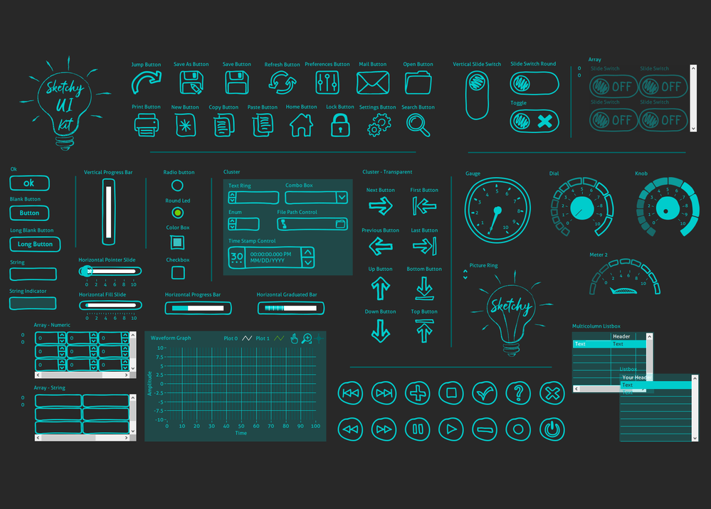
Here's our latest UI kit - Sketchy: 
I've designed it to add some fun to the traditional LabVIEW UI design. I came across this design idea as I thought wouldn't it be nice to have hand-drawn controls that can make my software look absolutely different?
Also, if you're interested, you can check out our other UI Kits, they are more classical.
- « Previous
-
- 1
- 2
- Next »
